REBRANDING DRIEVLIET PITCH
THE LOGO
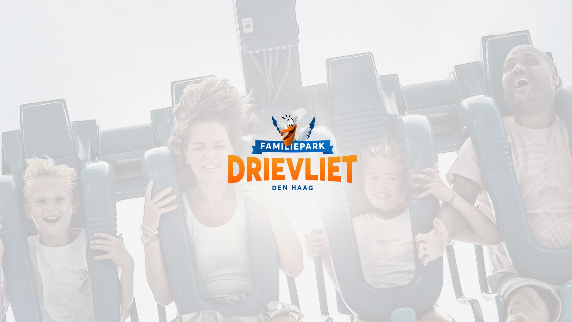
The new logo for Familiepark Drievliet has been thoughtfully crafted to capture the park’s vibrant, family-friendly atmosphere while reinforcing its unique identity in the heart of Den Haag. Here’s why this logo was chosen:
Playful Mascot for Family Appeal: The cheerful pelican with open wings is an inviting and joyful character, symbolizing warmth and excitement. Its exaggerated features and bright colors evoke a sense of fun and friendliness, perfect for a family-oriented theme park.
Bold, Modern Typography: The bold orange lettering is both dynamic and approachable, making the park's name instantly recognizable and memorable. The white outlines ensure high visibility against various backgrounds, reinforcing the park’s accessibility to all age groups.
Coastal Connection: The pelican, a bird commonly associated with coastal regions, ties into Den Haag’s proximity to the sea. This connection adds a local touch, reinforcing Drievliet’s roots in its community and making it distinct from other parks.
Vibrant Color Palette: The combination of bright blue, orange, and white creates a fresh, energetic aesthetic that appeals to both children and adults. Blue symbolizes trust and adventure, while orange evokes enthusiasm and creativity.
Ferris Wheel Silhouette: Subtly placed in the background, the Ferris wheel pays homage to classic amusement park rides, signaling excitement and thrill. It’s a clever nod to the attractions within Drievliet without overwhelming the main elements.
Memorable and Versatile: This logo is designed to be flexible across different mediums, whether on digital platforms, merchandise, signage, or promotional materials. Its strong visual elements ensure brand consistency while remaining eye-catching in any context.
By choosing this logo, Familiepark Drievliet sets a tone of joyful adventure, local pride, and timeless family fun, perfectly positioning itself for future growth and recognition in Den Haag and beyond.
2. COLORS
The combination of blue and orange strikes a balance between trust and excitement, professionalism and playfulness. This contrast ensures that the brand feels lively yet dependable, appealing to both young visitors and their parents. Additionally, the gradients add a modern and dynamic touch, ensuring the brand remains visually fresh and engaging across various mediums.
This carefully curated color palette enhances Drievliet’s brand identity, making it instantly recognizable, memorable, and emotionally resonant.

3. FONT
1. Modern and Clean Aesthetic
Aaux Next embodies a modern, clean, and minimalistic design that aligns with the park's vision for a contemporary yet approachable brand identity. Its simple and streamlined letterforms reflect clarity and professionalism while maintaining a friendly tone, perfect for a family-oriented environment.
2. Versatility Across Mediums
This font excels in its versatility, making it suitable for both digital and print applications. Whether on signage, social media posts, or merchandise, Aaux Next maintains legibility and visual appeal across various formats and sizes.
3. Friendly and Approachable Personality
While maintaining a professional edge, Aaux Next’s rounded forms and open character spacing convey a warm and welcoming feel. This complements Drievliet’s family-friendly atmosphere, making the park seem inviting and inclusive to all age groups.
4. Timeless Design
Aaux Next avoids trends that may quickly feel outdated. Its timeless design ensures that the brand remains fresh and relevant for years to come, supporting Drievliet’s long-term branding strategy.
5. Strong Visual Impact
The bold, well-balanced letterforms of Aaux Next make it easy to read at a glance, ensuring high visibility in environments like theme parks where quick recognition is essential. This is particularly valuable for wayfinding signs, promotional materials, and digital screens.
6. Cohesion with the Visual Identity
The clean lines of Aaux Next pair seamlessly with the bright colors and playful imagery in the new logo. This cohesion strengthens brand recognition, making every visual element work together harmoniously.
In summary, Aaux Next supports Drievliet’s mission to create a memorable, modern, and family-friendly brand experience, making it the ideal font choice for this rebranding initiative.

4. EXAMPLES


5. Proposal for Rebranding Familiepark Drievliet
Proposal for Rebranding Familiepark Drievliet
Client: Familiepark Drievliet (Looping group)
Contractor: VINUTS
Date: 02-11-2024
Project Description
This proposal outlines the complete rebranding of Familiepark Drievliet. The project includes the design of a new logo, development of social media elements, logo animation, signing, and the creation of a comprehensive brand guide. Additionally, colors, fonts, and style guidelines will be defined, with all deliverables provided in multiple formats (vector, EPS, PNG).
Hourly Rate
€135 per hour
Estimated Hours and Cost Breakdown
Task Hours Total Cost Logo Design
Concept Development and Pitch 5 hours €675
Feedback Loop (Looping Group) 5 hours €675
Social Media Elements
Concept Development and Pitch 3 hours €405
Feedback Loop (Looping Group) 3 hours €405
Logo Animation
Concept Development and Pitch 2 hours €270
Feedback Loopinggroup 5 hours €675
Signing
Concept Development and Pitch 3 hours €405
Feedback Loop 3 hours €405
Brand Guide (Brandbom)
10 hours €1,350
Color, Font, and Style Definition 3 hours €405
Final Delivery (vector/EPS/PNG files) 3 hours €405
Summary of Costs
Category Cost
Logo Design €1,350
Social Media Elements €810
Logo Animation €945
Signing €810
Brand Guide (Brandbom) €1,350
Color, Font, and Style Definition €405
Final Delivery €405
Total (excl. VAT) €6,075
VAT (21%) €1,275.75
Total (incl. VAT) €7,350.75
Terms of Delivery
Feedback rounds are included as specified. Additional feedback rounds will be billed at the hourly rate.